Building your first website feels overwhelming. The terminology alone – hosting, domains, HTML, CSS, responsive design – creates anxiety before you even start. The good news? Modern free website builders eliminate nearly all technical complexity.
You can create a professional-looking website in an afternoon without writing code or understanding server architecture.
This guide walks you through the entire process from concept to launch, explaining every decision and avoiding jargon wherever possible.
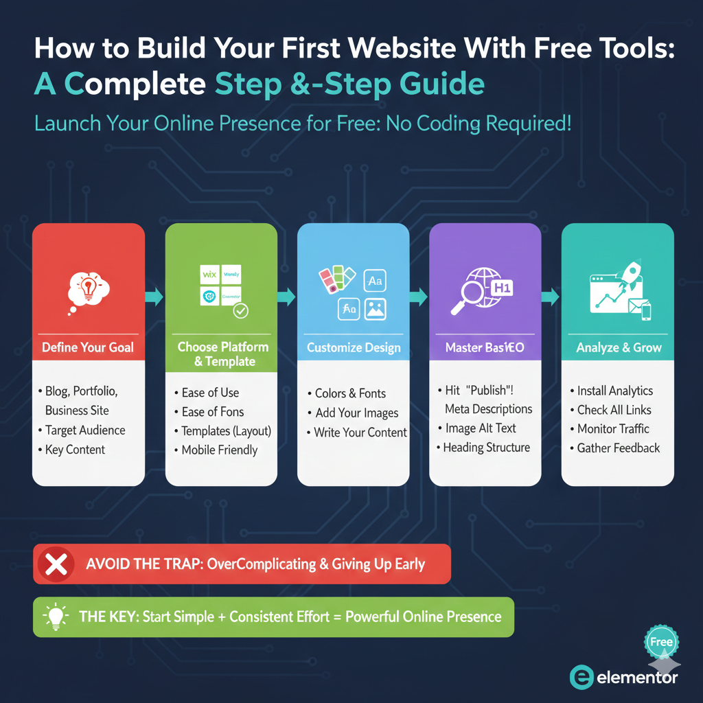
Step 1: Define Your Website’s Purpose
Before touching any tools, clarify exactly why you’re building this website. This clarity guides every subsequent decision.
Ask yourself:
What’s your primary goal? Are you showcasing portfolio work, selling products, sharing knowledge through blogging, promoting services, or establishing credibility?
Who’s your audience? Teenagers on social media, corporate decision-makers, fellow hobbyists, or local community members? Your audience shapes your design and content approach.
What action do you want visitors to take? Contact you, purchase products, read articles, download resources, or simply learn about you?
Write these answers down. They become your North Star when making design choices.
Step 2: Choose Your Website Builder
Based on your purpose, select the appropriate free builder:
For bloggers and content creators: WordPress.com’s free plan provides excellent writing tools, categories, tags, and RSS feeds. The platform is built for content publishing.
For visual portfolios: Wix offers beautiful templates and design flexibility perfect for photographers, designers, and creative professionals.
For simplicity seekers, Weebly or Site123 provides the easiest learning curves with minimal options to overwhelm beginners.
For Google users: Google Sites integrates seamlessly if you already use Google Workspace tools.
Don’t agonize over this choice. Any reputable builder can create functional websites. You can always migrate later if needed.
Step 3: Sign Up and Initial Setup
Visit your chosen builder and create an account. You’ll need:
- Email address
- Password
- Basic information (name, website purpose)
Most builders ask questions during signup to customize your experience:
“What type of website are you building?” “What industry are you in?” “What features do you need?”
Answer honestly – these responses help the platform recommend relevant templates and features.
Step 4: Select Your Template
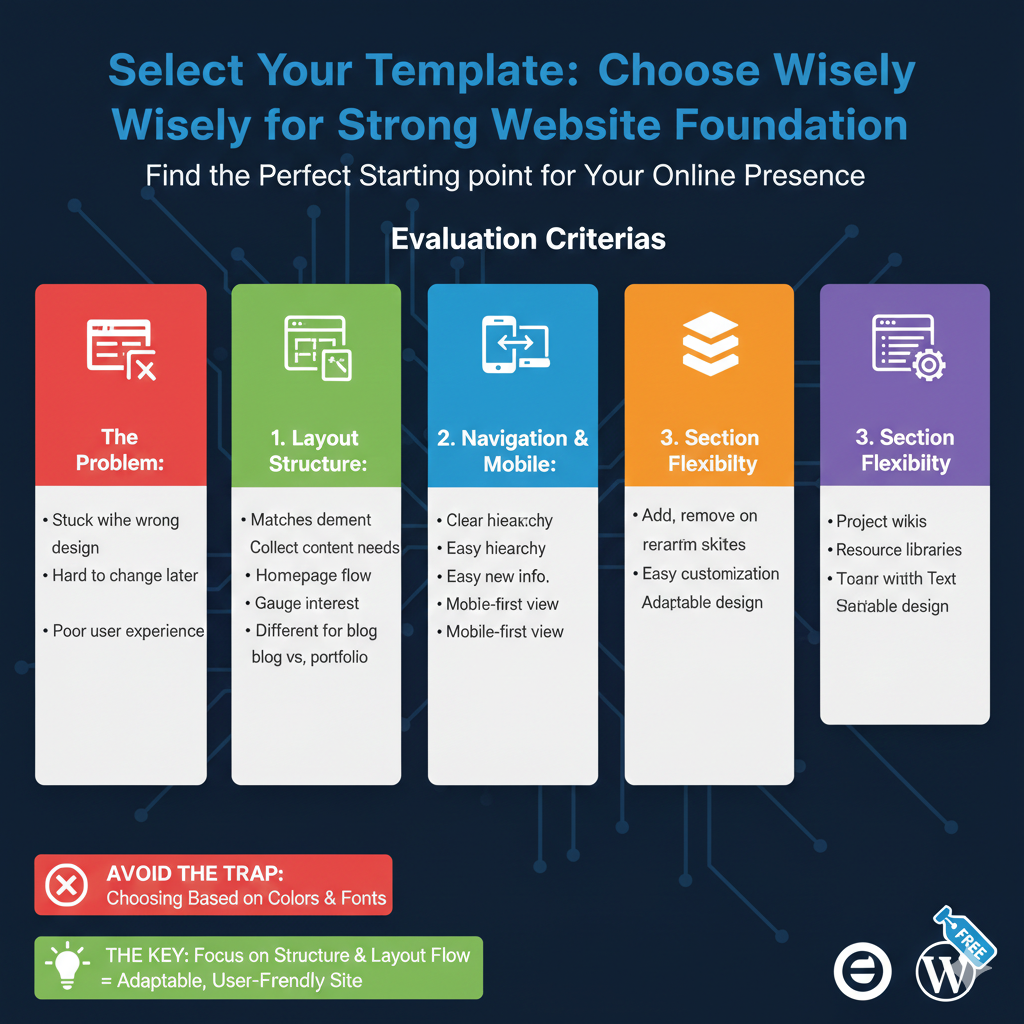
Templates provide your site’s basic structure and design. Choose wisely, as switching templates later often requires rebuilding content.
Browse templates in your category (portfolio, blog, business, etc.). Evaluate based on:
Layout structure: Does the homepage layout match your content needs? If you have lots of written content, you need a different structure than a photo portfolio.
Navigation clarity: Can you easily understand where different pages go? Visitors shouldn’t need a map to find information.
Mobile appearance: View template previews on mobile. Over 60% of web traffic comes from phones – mobile appearance matters more than desktop.
Section flexibility: Can you add, remove, or rearrange sections easily? You’ll likely customize significantly.
Don’t obsess over colors or fonts – those are easily changed. Focus on structure and layout flow.
Step 5: Plan Your Page Structure
Most websites need these core pages:
Homepage: Your front door. Clearly communicate what you offer and guide visitors to relevant sections. Include a compelling headline, a brief description, and clear navigation.
About: Build trust by sharing your story, credentials, or business background. People connect with people, not faceless entities. Include a photo if appropriate.
Services/Products/Portfolio: Showcase your offerings with clear descriptions, images, and pricing (if applicable). Organize logically – don’t make visitors hunt for information.
Blog (optional): If sharing regular content, you need a blog section with categories and archives.
Contact: Make reaching you easy. Include a form, email address, phone number (if appropriate), and physical address (for local businesses).
Sketch this structure on paper before building. Understanding your information architecture prevents constant reorganization later.
Step 6: Customize Your Template
Now comes the fun part – making the template your own.
Adjust Colors
Choose a cohesive color palette. Free tools like Coolors.co help generate complementary colors. Stick to 2-3 main colors maximum to avoid visual chaos.
Apply your brand colors (if you have them) or select colors that match your industry and emotion. Law firms typically use blues and grays for trust and professionalism. Creative agencies might use bold, vibrant colors. Children’s services use warm, friendly colors.
Select Fonts
Most builders offer 50-100 font options. Choose two fonts maximum:
- A headline font (can be decorative but must be readable)
- A body font (must be extremely readable in paragraphs)
Avoid script or decorative fonts for body text – they’re tiring to read in paragraphs. Stick to clean sans-serif fonts like Open Sans, Lato, or Roboto for body text.
Replace Placeholder Images
Template images are placeholders. Replace them with your own photos, illustrations, or free stock images from Unsplash or Pexels.
Critical: Compress images before uploading. Large images slow your site dramatically. Use free tools like TinyPNG or Squoosh to reduce file sizes without visible quality loss. Aim for under 200KB per image.
Write Your Content
Replace template text with your actual content. Write conversationally, as if explaining to a friend. Avoid corporate jargon and buzzwords.
Follow these principles:
Clarity over cleverness: Don’t make visitors decode your meaning. State benefits plainly.
Focus on visitors, not you: Instead of “We offer the best customer service,” write “You’ll get answers within 2 hours, guaranteed.”
Use short paragraphs: 2-3 sentences maximum. Walls of text intimidate readers.
Include specific details: “We’ve helped 150+ local businesses” beats “We’ve helped many businesses.”
Add headers liberally: Break content into scannable sections with descriptive headers.
Step 7: Configure Navigation
Your menu guides visitors through your site. Keep it simple:
- 5-7 menu items maximum on desktop
- 3-5 on mobile (hide less important items in a “More” menu)
- Use clear labels (Home, About, Services, Blog, Contact)
- Avoid clever naming that requires interpretation
Test your navigation by asking someone unfamiliar with your site to find specific information. If they struggle, your navigation needs simplification.
Step 8: Add Essential Features
Most sites need these basic features:
Contact Form
Add a simple form with these fields:
- Name
- Message
Avoid requesting unnecessary information. Each additional field reduces submission rates significantly. You can gather more details during follow-up conversations.
Test the form yourself to ensure submissions reach your email. Many builders require email confirmation – don’t skip this step.
Social Media Links
Link to your active social profiles. Don’t link to empty or abandoned profiles – it signals neglect.
Place social links in your footer or header for accessibility without cluttering your main content.
Google Analytics
Even on free plans, most builders allow adding Google Analytics tracking codes. This free tool shows visitor statistics, traffic sources, and popular content.
Sign up for Google Analytics, get your tracking ID, and add it through your builder’s settings. You’ll thank yourself later when you want to understand your traffic.
Step 9: Mobile Optimization
Over 60% of web traffic happens on mobile devices. Your site must work perfectly on phones.
Most builders automatically create mobile versions, but you should verify:
- Text is readable without zooming
- Buttons are large enough to tap accurately
- Images scale properly
- Navigation works smoothly
- Forms are easy to complete on small screens
Preview your site on your actual phone, not just the builder’s mobile preview. Real-world testing catches issues simulators miss.
Step 10: SEO Basics
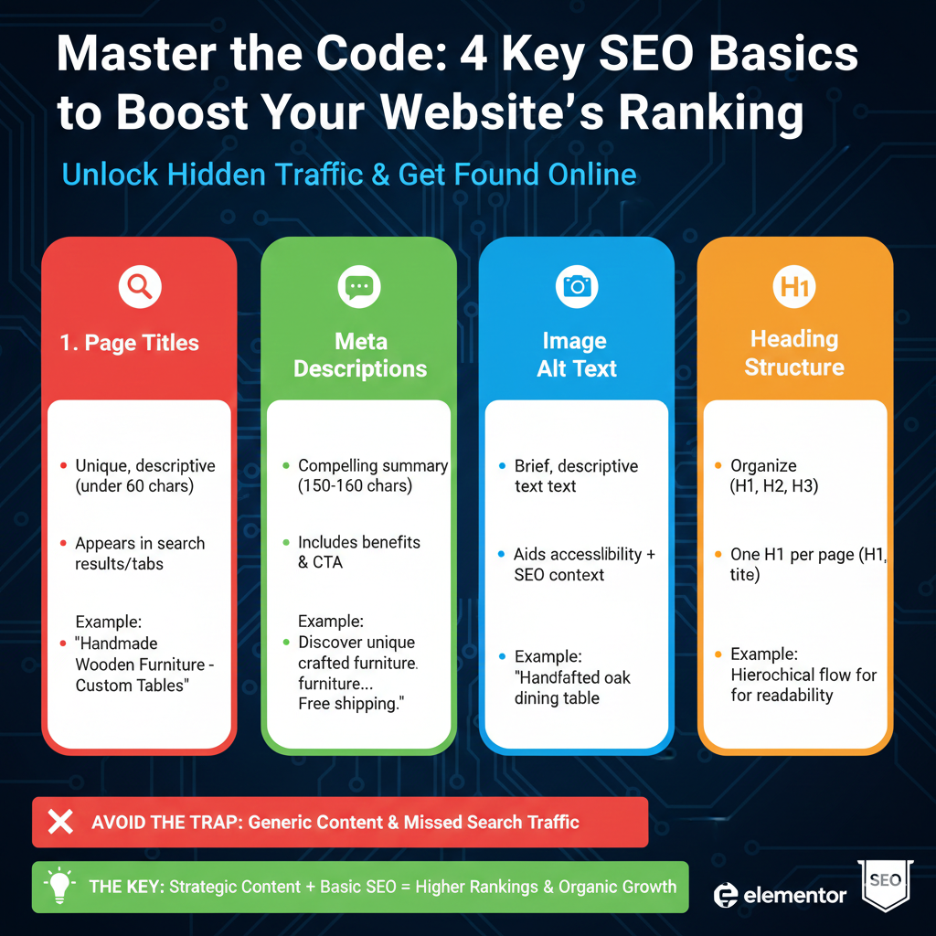
Search Engine Optimization helps people find your site through Google. Even free plans support basic SEO:
Page Titles
Each page needs a unique, descriptive title under 60 characters. The title appears in search results and browser tabs.
Good: “Handmade Wooden Furniture – Custom Tables & Chairs” Bad: “Home” or “Welcome to My Website”
Meta Descriptions
Write a compelling 150-160-character summary for each page. This text appears under your title in search results.
Focus on benefits and include a call-to-action: “Discover unique handmade furniture crafted from sustainable wood. Custom designs available. Free shipping on orders over $500.”
Image Alt Text
Describe each image briefly. This helps visually impaired visitors and gives search engines context. “Handcrafted oak dining table with steel legs” beats “IMG_1234.”
Heading Structure
Use headings (H1, H2, H3) to organize content. Each page gets one H1 (usually the page title), with H2s for main sections and H3s for subsections. This hierarchy helps search engines understand your content.
Step 11: Test Everything Thoroughly
Before launching, test exhaustively:
Click every link: Ensure nothing leads to 404 errors or wrong pages.
Submit forms: Verify you receive submissions at the correct email.
Test on multiple browsers: Check Chrome, Safari, Firefox, and Edge. Sites occasionally render differently.
Load on different devices: View on your phone, tablet, and computer. Ask friends to check on their devices.
Review all content: Typos and grammatical errors undermine credibility. Read everything aloud to catch mistakes.
Check loading speed: Use free tools like GTmetrix or Google PageSpeed Insights. If pages load slowly, compress images further or remove heavy elements.
Step 12: Launch Your Site
Hit publish! Your site goes live on its subdomain (yourname.builder.com).
Share your new site on social media, include it in email signatures, add it to business cards, and submit it to Google Search Console to speed up indexing.
Beyond Free Plans: When to Upgrade
Free plans work perfectly for many use cases, but you might eventually need more:
If you’re generating revenue through your site, professional credibility demands a custom domain (yourname.com instead of yourname.builder.com). The $10-15 annual cost for a domain name is minimal compared to the credibility boost.
As your needs grow, you might explore self-hosted WordPress for unlimited flexibility. Modern hosting providers offer one-click WordPress installation, making setup surprisingly simple even for beginners.
The Elementor Pro Difference
Many people transition to WordPress for greater control, but initially find the default editor less intuitive than drag-and-drop builders. The block editor works for content but lacks visual layout control.
Elementor Pro solves this by bringing builder-like visual editing to WordPress. You design by dragging elements, adjusting spacing visually, and seeing results in real-time. The familiar drag-and-drop experience makes the WordPress transition comfortable.
Beyond page building, Elementor Pro adds powerful features unavailable on free builders:
Custom popups for email collection or promotions trigger based on user behavior. Someone about to leave your site sees an exit-intent pop-up offering a discount code, potentially recovering the sale.
Advanced forms with conditional logic adapt based on user selections. A contact form might reveal project budget fields only when someone selects “Request Quote,” streamlining the experience.
Theme building capabilities let you design custom headers, footers, and templates that apply site-wide. Create a unique archive page for blog posts or customize your search results page.
For online stores, Elementor Pro Free customizes WooCommerce product pages, checkout flows, and cart pages beyond default templates. Match your store’s appearance to your brand instead of looking generic.
At $59 annually for personal use, it’s remarkably affordable compared to standalone tools for popups ($30-50), forms ($30-70), and page building ($40-80). The investment makes sense when you’re building something that matters.
Common First Website Mistakes
Avoid these frequent errors:
Too much content: New site builders often cram everything onto the homepage. Be ruthless – highlight only essential information and let internal pages provide details.
Unclear purpose: Visitors should understand what you offer within 5 seconds. If your headline is vague or clever rather than clear, rewrite it.
Missing contact information: Don’t make people hunt for ways to reach you. Display contact options prominently.
Ignoring mobile: Designing only for desktop alienates most visitors. Always check the mobile appearance.
Premature perfection: Don’t wait until everything is perfect. Launch with a solid foundation and improve based on actual feedback.
Stock photo overload: Authentic photos of you, your work, or your team build trust. Generic stock photos feel impersonal.
Maintaining Your Website
Launching isn’t the end – websites require ongoing attention:
Update content regularly: Stale websites signal abandonment. Even monthly updates show you’re active and engaged.
Monitor analytics: Check your Google Analytics monthly. Which pages get traffic? Where do visitors come from? This data guides improvements.
Backup content: Copy your content to a document periodically. If something breaks, you can restore it.
Test periodically: Check your site quarterly to ensure forms work, links aren’t broken, and everything loads properly.
Respond to messages: If you include a contact form, actually respond to inquiries quickly. Ignored messages waste the form’s potential.
Your Next Steps
You now have everything needed to build your first website. The process breaks down into manageable steps – none requiring technical expertise.
Start today by choosing your website builder and signing up. Select a template that roughly matches your vision. Begin customizing with your content.
Don’t overthink decisions. Your first website teaches you what matters. You’ll refine and improve based on experience, not speculation.
The hardest part of building a website is starting. Technology has eliminated technical barriers, leaving only the psychological ones. Push past hesitation and create something. An imperfect website that exists beats a perfect website that remains imaginary.
Your online presence begins with this first step. Take it today.