Free website builders democratized web design, allowing anyone to create professional-looking sites without coding knowledge. However, this accessibility creates a false sense of simplicity. The tools are easy to use, but building effective websites requires strategic thinking that many beginners overlook.
After analyzing hundreds of websites built on free platforms, certain mistakes appear repeatedly. These errors waste time, hurt credibility, and limit growth potential. Worse, many are invisible to the site owner until significant damage occurs.
Let’s examine the most common and costly mistakes, why they happen, and how to avoid them.
Mistake 1: Choosing the Wrong Builder for Your Goals
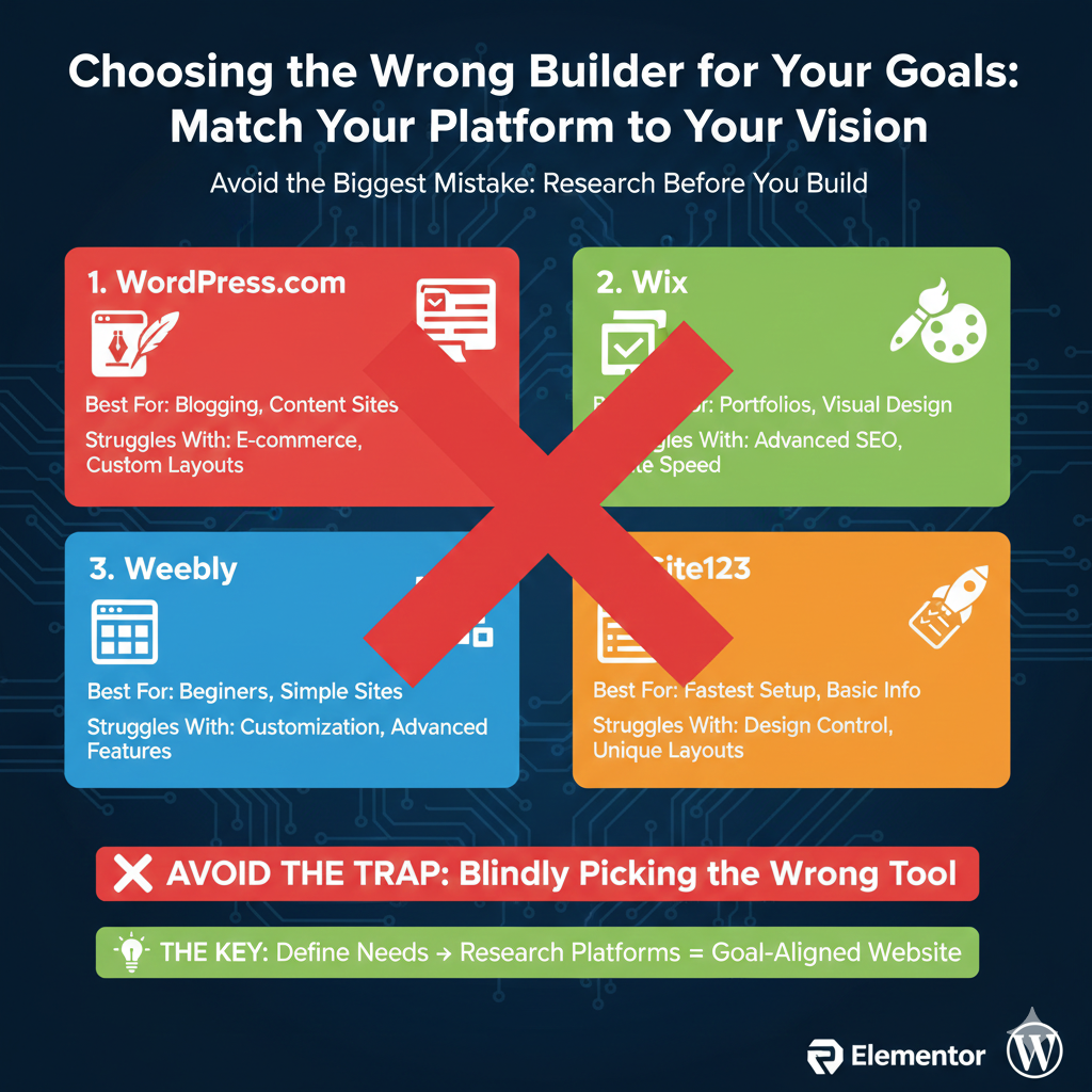
The biggest mistake happens before you create a single page: selecting a website builder that fundamentally misaligns with your goals.
Free website builders aren’t interchangeable. Each platform optimizes for different use cases:
WordPress.com excels at blogging and content-heavy sites. Its editor, categories, tags, and RSS feeds support serious content creation. The platform struggles with e-commerce and highly customized layouts.
Wix prioritizes design flexibility and visual creativity. It’s perfect for portfolios, small business sites, and anyone wanting precise control over appearance. However, SEO capabilities lag behind competitors, and the platform can feel slow with complex designs.
Weebly emphasizes simplicity and ease of use. Complete beginners succeed quickly with its straightforward interface. However, advanced users find it limiting – customization options are deliberately constrained.
Site123 optimizes for speed over flexibility. You can launch a basic site within an hour. This speed comes at the cost of design control – sites follow structured templates with minimal customization.
The mistake: Choosing based on brand recognition or friend recommendations rather than your specific needs.
A photographer building a portfolio chooses Wix for its visual flexibility. A blogger trying to publish 2-3 articles weekly chooses WordPress.com for its content tools. A hobbyist wanting the simplest possible setup chooses Weebly.
How to avoid it: Before selecting a builder, write down your website’s primary purpose and required features. Then research which platform best serves those specific needs. Don’t start building until you’ve validated your platform choice against your goals.
Mistake 2: Treating Templates as Final Designs
Templates provide starting points, not finished products. Yet many people select a template, add their content, and launch without meaningful customization.
The result? Your website looks remarkably similar to dozens or hundreds of other sites using the same template. Visitors subconsciously recognize the familiar layout, undermining your uniqueness and professionalism.
Templates include placeholder content carefully designed to showcase the layout. This content represents ideal scenarios – perfectly sized images, optimized text lengths, and balanced content distribution. Real content rarely matches these ideal conditions.
Your logo might be horizontal while the template expects a square icon. Your service descriptions might be longer than template placeholders. Your product images might have different aspect ratios than template photos.
Simply dropping your content into template placeholders creates visual awkwardness and layout breaks.
How to avoid it: View templates as inspiration and structure, not final designs. After selecting a template:
- Replace all colors with your brand palette
- Change fonts to match your brand or industry standards
- Significantly customize at least your homepage
- Adjust spacing and layouts to accommodate your actual content
- Replace generic stock photos with authentic images
Spend equal time customizing as creating content. A highly customized template looks unique and professional. An unmodified template looks generic and lazy.
Mistake 3: Ignoring Mobile Users Completely
Over 60% of web traffic comes from mobile devices, yet many people design exclusively for desktop computers. They build beautiful desktop layouts, launch their site, and never check mobile appearance.
The consequences are severe:
Text becomes unreadable without zooming. Buttons shrink to frustratingly tiny targets. Images extend beyond screen edges. Navigation becomes unusable. Forms become nearly impossible to complete on small screens.
Visitors encountering these issues simply leave. They won’t email you about the problems or try accessing your site on a desktop. They’ll assume unprofessionalism and move on.
The mistake compounds because website builders typically handle mobile responsiveness automatically. The platform creates mobile versions of your pages. But automatic doesn’t mean optimal.
Builders make conservative decisions – shrinking everything proportionally, stacking columns vertically, and simplifying navigation. These defaults often work acceptably but rarely perfectly.
Your carefully crafted three-column desktop layout might stack into a confusing vertical arrangement on phones. Your prominent desktop call-to-action button might appear below the fold on mobile, invisible without scrolling.
How to avoid it: Design mobile-first, not desktop-first. Start by creating your mobile layout, then enhance it for desktop. This approach ensures your site works perfectly for the majority of visitors.
Most builders include mobile preview modes. Use them constantly while building. But don’t stop there – view your actual site on your actual phone. Simulators miss problems real devices catch.
Test these specific elements on mobile:
- Can you read all text without zooming?
- Are buttons large enough to tap accurately?
- Does navigation work intuitively?
- Can you complete forms easily?
- Do images load quickly and scale properly?
- Is your primary call-to-action visible immediately?
If you’re redesigning an existing site, check your analytics for mobile vs desktop traffic ratios. If 70% of your visitors use mobile, your mobile experience deserves 70% of your design attention.
Mistake 4: Creating Confusing Navigation
Navigation seems obvious – list your pages in a menu, and you’re done. Yet confusing navigation ranks among the most common website problems.
The mistakes take several forms:
Too many menu items: Cramming 10-12 links into your main navigation overwhelms visitors with choices. Decision paralysis sets in. They don’t know where to start, so they leave.
Unclear labels: Creative menu names might seem clever, butthey often confuse visitors. “Our Story” is clearer than “The Journey.” “Services” beats “What We Do.” “Contact” trumps “Let’s Connect.”
Illogical organization: Menu items should follow a natural information hierarchy. Mixing primary pages with minor pages creates confusion. “Home – About – Blog – Privacy Policy – Services – Contact” buries your services link between secondary pages.
Inconsistent structure: Some pages have submenus while others don’t, without clear patterns. Visitors can’t predict where information lives.
Mobile navigation neglect: Your desktop menu might work perfectly, but translates poorly to mobile’s hamburger menu. Five desktop menu items might expand to 15 mobile menu items once submenus are included.
The underlying issue: You know your site’s structure intimately. Where everything lives seems obvious to you. Visitors lack this familiarity. What’s obvious to you might be mysterious to them.
How to avoid it: Limit main navigation to 5-7 items maximum. For larger sites, use dropdown menus to organize related pages under primary categories.
Test your navigation with the “5-second rule”: Show your homepage to someone unfamiliar with your site for 5 seconds. Then ask them where they’d find specific information. If they can’t answer confidently, your navigation needs simplification.
Use standard naming conventions. Your creativity belongs in your content, not your navigation labels. Visitors have been trained by thousands of websites to expect “Contact”, not “Get in Touch.”
Create a visual hierarchy in your navigation order:
- Home
- Primary pages (About, Services, Products)
- Blog or Resources
- Contact
Place secondary pages (Privacy Policy, Terms, FAQs) in your footer, not main navigation.
Mistake 5: Underestimating Content Quality
Website builders make creating pages effortless. This ease creates a dangerous assumption: if building pages is easy, filling them with content must be easy too.
It’s not.
Many people launch sites with placeholder text still visible, half-finished pages, or thin content that provides little value. The technical infrastructure exists, but the substance doesn’t.
Common content mistakes include:
Generic boilerplate text: “We’re passionate about providing excellent service to our valued customers.” This says nothing specific or meaningful.
Feature-focused instead of benefit-focused: Listing what you offer without explaining why it matters. “We use advanced technology” doesn’t resonate like “You’ll get results in half the time.”
Walls of text: Dense paragraphs intimidate readers. Most people scan rather than read. Walls of text go unread.
Missing calls-to-action: Pages provide information but don’t guide visitors toward next steps. What should someone do after reading?
Typos and grammatical errors: Nothing undermines credibility faster than sloppy writing. Professional services riddled with typos signal a lack of attention to detail.
The difficulty is compounded because writing for the web differs from other writing. Web readers scan, skim, and jump between sections. They rarely read linearly from top to bottom.
How to avoid it: Invest time in content creation equal to design. A beautifully designed site filled with weak content fails. A simply designed site with exceptional content succeeds.
Follow these content principles:
Be specific: Replace generic statements with concrete details. “150+ satisfied clients” beats “many happy customers.”
Use short paragraphs: 2-3 sentences maximum. White space improves readability dramatically.
Include headers liberally: Break content into scannable sections with descriptive headers that let readers jump to relevant information.
Focus on benefits: Explain what’s in it for the reader. Features matter less than outcomes.
Add clear calls-to-action: Every page should guide visitors toward the next step. “Schedule a consultation,” “Download the guide,” “Browse our portfolio.”
Edit ruthlessly: First drafts are always too long. Cut unnecessary words, phrases, and sentences. Tighten your prose.
Before launching, read your content aloud. Awkward phrasing becomes obvious when spoken. If you stumble reading it, visitors stumble understanding it.
Mistake 6: Neglecting Loading Speed
Free website builders handle hosting and performance automatically. This creates a false sense of security – surely the platform optimizes everything?
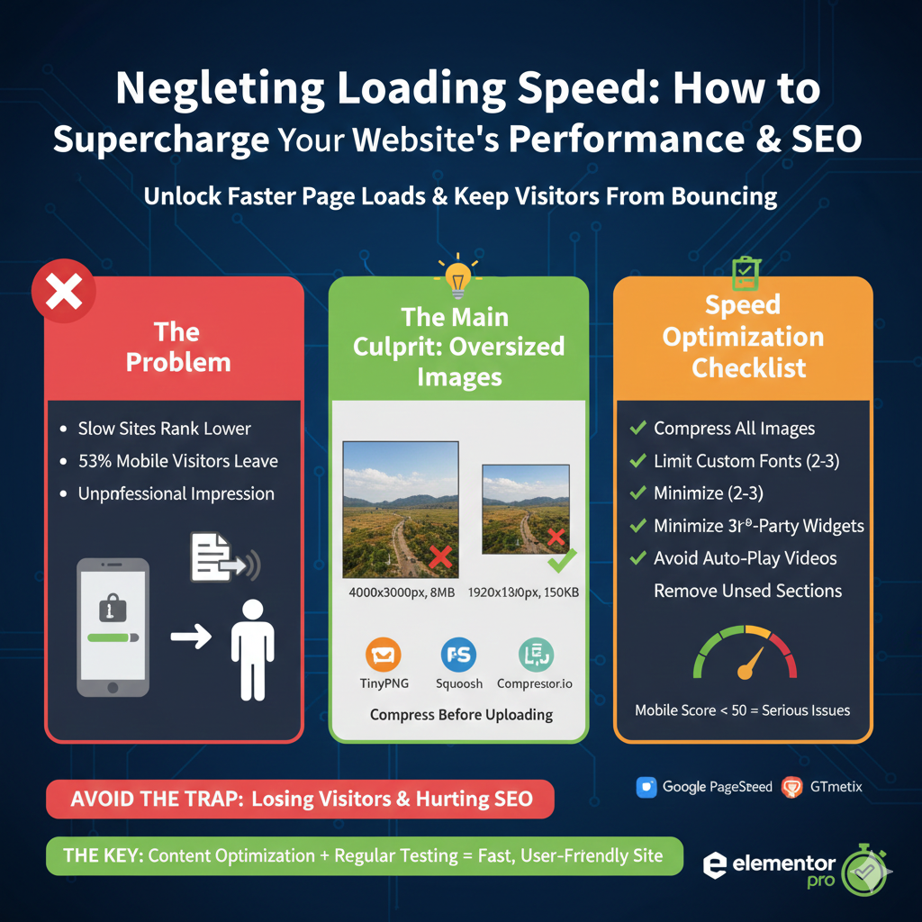
Not quite. The platform optimizes infrastructure, but you control content. Massive images, videos, custom fonts, and third-party widgets dramatically slow loading times.
Page speed matters enormously:
Google prioritizes fast sites: Slow sites rank lower in search results. Two identical sites with similar content will see the faster site rank higher.
Users abandon slow sites: 53% of mobile visitors leave if pages take longer than 3 seconds to load. Your content becomes irrelevant if people leave before seeing it.
Slow sites signal unprofessionalism: Visitors subconsciously associate slow loading with low quality.
The most common speed killer: oversized images. Modern smartphone cameras capture 4000×3000 pixel images at 5-10MB file sizes. These images contain far more data than necessary for web display.
A full-width website image rarely needs more than 2000 pixels wide. Most images display much smaller. A 300×300 pixel thumbnail doesn’t need a 4000×3000 source file.
How to avoid it: Compress every image before uploading. Free tools like TinyPNG, Squoosh, or Compressor.io reduce file sizes 60-80% without visible quality loss.
Aim for these maximum file sizes:
- Full-width hero images: 300KB
- Standard page images: 150KB
- Thumbnails and icons: 50KB
Beyond images:
- Limit custom fonts to 2-3 maximum
- Minimize third-party widgets (social feeds, live chats, etc.)
- Avoid auto-playing videos
- Remove unused template sections
Test your site speed using Google PageSpeed Insights or GTmetrix. These free tools identify specific problems and suggest fixes.
If your site scores below 50 on mobile, you have serious speed issues requiring immediate attention.
Mistake 7: Staying on Free Plans Too Long
Free plans work perfectly for specific use cases: personal projects, testing ideas, learning, or temporary event sites. However, many people remain on free plans long after outgrowing them.
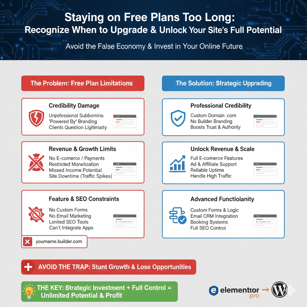
This creates several problems:
Credibility damage: Professional services appearing on “yourname.builder.com” subdomains raise legitimacy questions. Potential clients wonder if you’re serious about your business.
Revenue limitations: Free plans severely restrict or prohibit monetization. You can’t sell products effectively, run advertisements, or implement advanced payment processing.
Missed opportunities: SEO limitations on free plans mean fewer people find your site through search engines. Storage and bandwidth caps might cause your site to go offline during traffic spikes.
Growth constraints: As your needs evolve, free plans become increasingly restrictive. Want to add booking functionality? Need custom forms with conditional logic? Want to integrate with email marketing platforms? Free plans often don’t support these features.
The calculation seems simple: why pay when free works? But “works” and “works optimally” are different standards.
A consultant generating $5,000 monthly who won’t spend $15 for a custom domain is making a costly false economy. That subdomain potentially costs thousands in lost credibility and missed opportunities.
How to avoid it: Regularly evaluate whether your free plan still serves your goals or limits them.
Upgrade when:
- Your website connects to revenue generation
- You need professional credibility in your industry
- You’re hitting storage, bandwidth, or feature limitations
- SEO and search rankings matter to your success
- You want to integrate with other business tools
For many people, the right long-term solution isn’t upgrading their current builder’s paid plan but transitioning to self-hosted WordPress. Modern hosting starts at $5-10 monthly, providing complete control and unlimited potential.
The WordPress + Elementor Pro Combination
WordPress intimidates many people because its default editor lacks the visual simplicity of drag-and-drop builders. You’re editing content, not designing layouts.
Elementor Pro solves this beautifully. It brings builder-like visual editing to WordPress – you design by dragging elements, adjusting spacing visually, and seeing real-time results without switching between edit and preview modes.
Beyond comfortable page building, Elementor Pro pluging free adds capabilities unavailable on free builders:
Create sophisticated popups triggered by user behavior. Someone showing exit intent sees a special offer, potentially recovering an abandoned visitor. A visitor who scrolls 75% down a blog post sees an email signup form, capturing engaged readers.
Build advanced forms with conditional logic that adapts based on selections. A contact form reveals different fields depending on whether someone selects “Sales Inquiry” or “Support Request,” streamlining the experience.
Design completely custom WordPress themes, including headers, footers, and archive pages. Control your site’s entire visual appearance without coding.
For online stores, customize WooCommerce product pages, checkout flows, and cart pages beyond default templates. Match your store’s appearance to your brand.
At $59 annually, it’s remarkably affordable compared to buying separate tools for popups ($30-50), forms ($30-70), and page building ($40-80). The investment consolidates functionality while ensuring everything works together seamlessly.
Combined with affordable hosting, you build a foundation that grows with your needs. You’re not locked into platform limitations – you can add any functionality through WordPress’s 60,000+ plugin ecosystem.
Recognizing Your Mistakes Early
These mistakes aren’t failures – they’re learning opportunities. Nearly everyone makes some of them when building their first website. The key is recognizing and correcting them before they cause lasting damage.
Review your existing site (or plan for your new site) against this checklist:
- Does my builder match my primary goals?
- Have I significantly customized my template?
- Does my site work perfectly on mobile?
- Can visitors easily find information through clear navigation?
- Is my content specific, valuable, and well-written?
- Do my pages load quickly (under 3 seconds)?
- Am I using the right plan tier for my current needs?
Address any gaps now. Websites aren’t static – continuous improvement based on actual usage and feedback creates success.
Your website serves specific purposes. These mistakes prevent it from serving those purposes effectively. Avoiding them doesn’t guarantee success, but it removes preventable obstacles between you and your goals.
Start with awareness, continue with action, and maintain with regular evaluation. Your website becomes a genuine asset rather than digital overhead.